
Unlike food correlations (which need weeks to detect usable patterns), nutrient correlations work immediately. Based on NIH research linking nutrients to symptoms, TCT compares your intake to known deficiencies and excesses—giving you actionable insights from day one.
Quick Review: Dashboard Nutrient Correlations
Before diving into the full tool, here's what you already see on your Dashboard:
Under Symptom-Nutrient Correlations, each symptom shows:
- All nutrients (both deficiencies and excesses) associated with that symptom
- 30-day average consumption for each nutrient
- Color coding:
- Yellow = Your intake is out of range (too high or too low)
- Green = You're within the healthy range
- Grey = No consumption data available
This gives you a quick at-a-glance view. For deeper analysis, use the full tool.
Two Ways to Access the Deep Dive Tool
Option 1: From Your Dashboard
- Scroll to Symptom-Nutrient Correlations section
- Select the symptom you want to analyze
- Opens the full tool page
Option 2: From Your Symptoms Page
- Tap Symptoms on the bottom ribbon
- Select the symptom you want to dive into (tap the arrow)
- Scroll to the analysis cards
- Tap "Discover Symptom-Nutrient Correlations"
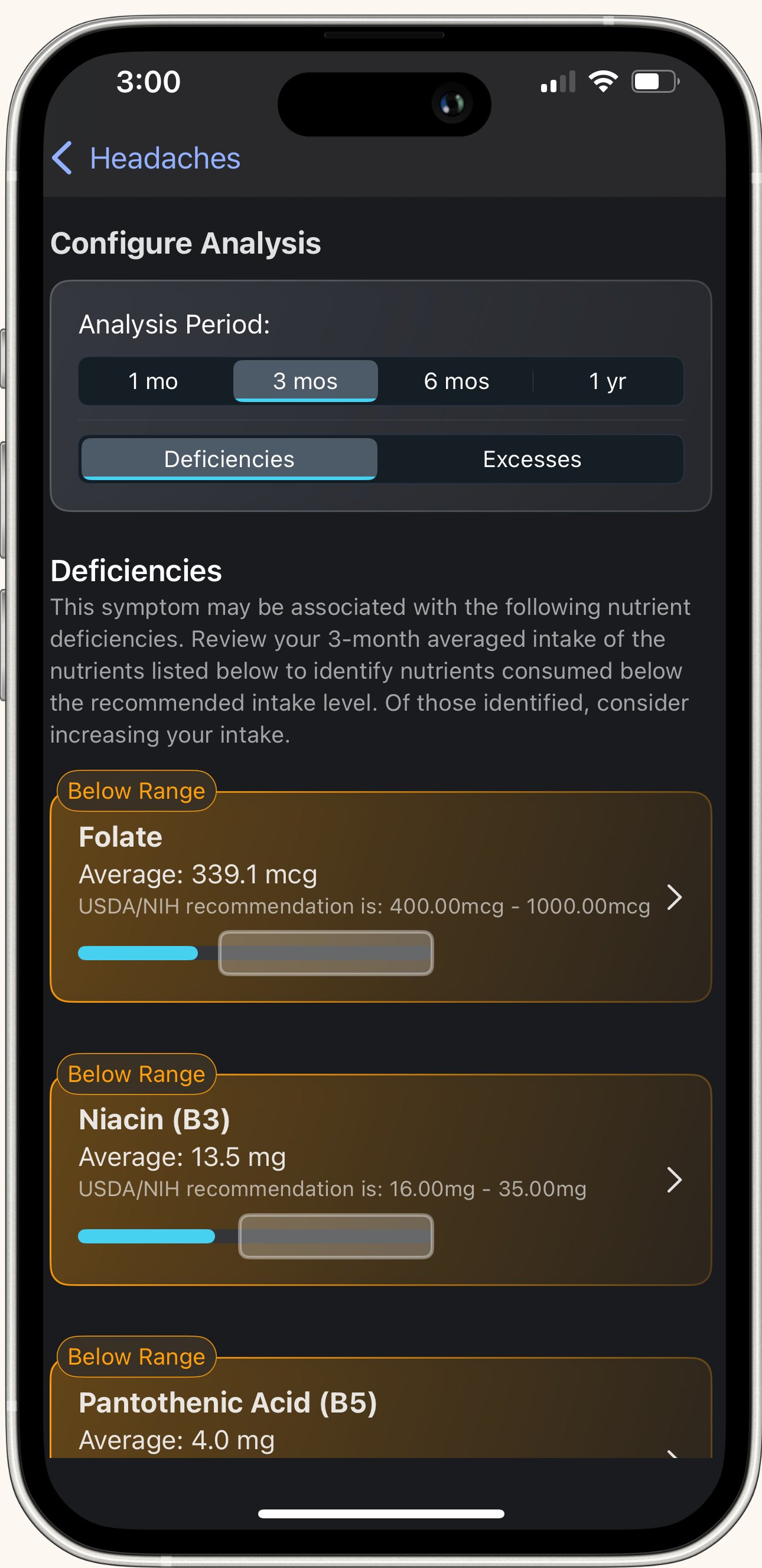
The Symptom-Nutrient Correlations Page
What You'll See:
At the top: The symptom name you're analyzing
Below that: A configurable analysis card with two controls
Customizing Your Analysis
1. Time Range Selector
Choose how far back to average your nutrient intake:
- 1 month
- 3 months
- 6 months
- 1 year
What this does: TCT calculates your average daily consumption over the selected period.
Why it matters: Longer timeframes = more stable averages. If you just started tracking, use 1 month. If you've been logging consistently, longer periods give more reliable data.
2. Deficiency vs. Excess Toggle
Switch between two views:
Deficiencies: Shows nutrients you may be consuming too little of—and that are linked to your symptom. Check your consumption level to see where you may need to improve.
Excesses: Shows nutrients you may be consuming too much of—and that are linked to your symptom. Check your consumption level to see where you may need to improve.
Why separate views? Some symptoms are caused by deficiencies (not getting enough of something). Others are caused by excesses (getting too much). Check both.
Understanding Your Results
For each nutrient, you'll see:
Nutrient Name
You Average Consumption based upon the timeline you select: Your actual daily average intake
Recommended Intake Amount: The healthy range for this nutrient (based on NIH guidelines). Pulled from your profile and based upon USDA dietary guidelines.
Color Coding:
- Yellow = Out of range (your intake is too low or too high compared to recommendations)
- Green = In range (you're good!)
- Grey = No consumption data (you haven't logged foods containing this nutrient)
What This Means
Yellow (Out of Range) in Deficiencies View: You're consistently low on this nutrient, and research links this deficiency to your symptom.
Action: Increase foods rich in this nutrient or consult a healthcare provider about supplementation. Select the nutrient and you'll find additional information including why the nutrient is important and what foods are rich in it.
Yellow (Out of Range) in Excesses View: You're consistently high on this nutrient, and research links excess intake to your symptom.
Action: Reduce foods high in this nutrient.
Green (In Range):Your intake is healthy. This nutrient probably isn't contributing to your symptoms.
Grey (No Data):You haven't logged foods containing this nutrient, so TCT can't calculate your average.
Action: Keep logging—data will appear as you add more foods.
Why This Tool Works Immediately
Research-Backed Connections: TCT uses established NIH data linking specific nutrients to symptoms. These connections already exist—TCT just checks if YOUR intake matches the patterns.
Example: NIH research shows low iron is linked to fatigue. If you're logging fatigue and your iron intake is consistently below recommendations, TCT flags it immediately.
No pattern detection needed. The research is already done—TCT just compares your numbers.
Best Practices
✅ Check both Deficiencies and Excesses - Some symptoms have triggers in both categories
✅ Use the longest timeframe you have data for - More stable averages
✅ Focus on yellow (out of range) nutrients first - These are your action items
✅ Cross-reference with food logs - What foods are you missing (or eating too much of)?
✅ Adjust your diet based on findings - Increase deficient nutrients, reduce excess ones
✅ Recheck after dietary changes - See if your averages shift into the green
✅ Consult a healthcare provider for supplementation - Especially for severe deficiencies
Common Questions
Q: Why do some nutrients show grey (no data)? You haven't logged foods containing those nutrients yet. Keep tracking—data will populate.
Q: Can I ignore green nutrients? Usually. Green means your intake is healthy and unlikely to be causing this symptom. However, always consult a healthcare provider for specific guidance.
Q: Should I take supplements for every yellow deficiency? Not necessarily. Try adjusting your diet first. For persistent deficiencies or medical concerns, consult a healthcare provider.
Q: What if everything is green but I still have symptoms? Check the Suspect Food Analysis tool—your trigger might be a specific food, ingredient, or allergen rather than a nutrient imbalance.
Q: How often should I check this tool? Regularly - especially after making dietary changes. Give it time to reflect new averages.
How This Fits Into Your Journey
Week 1: Immediate insights on potential nutrient issues. Start adjusting diet.
Week 2-4: Averages stabilize. See if dietary changes move nutrients into the green.
Month 2+: Long-term patterns become clear. Use this to fine-tune your nutrition strategy.
Ongoing: Recheck periodically, especially if symptoms change or you adjust your diet significantly.
Bottom Line: The Symptom-Nutrient Correlation tool gives you research-backed insights from day one. Check both deficiencies and excesses, focus on yellow (out of range) nutrients, and use the findings to adjust your diet. Unlike food correlations that need time to build patterns, this tool is immediately actionable—and it gets more accurate the longer you track.