
Your Dashboard is home base. It's where you see everything important about your health tracking in one place—no digging through menus or reports.
Think of it as your daily health snapshot: what you've logged, what patterns are emerging, and what you should pay attention to next.
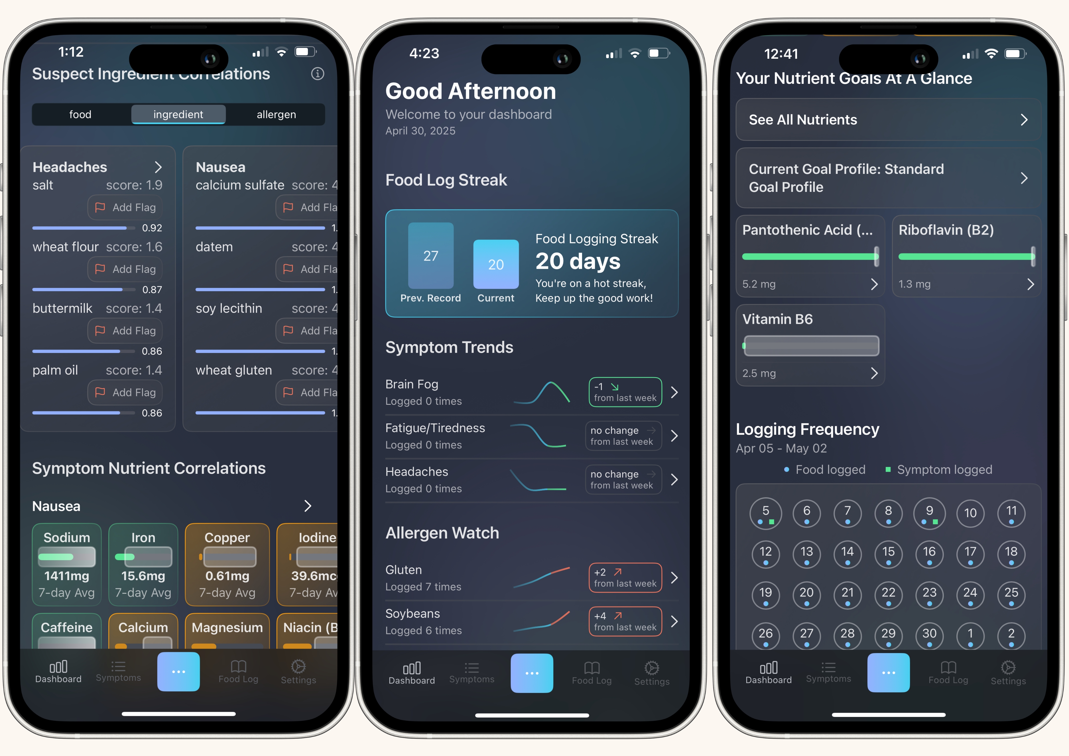
What's on Your Dashboard
Your Dashboard has five main sections, each designed to answer a different question:
- Symptom & Watch Item Trends - Are my symptoms improving? Am I avoiding my trigger foods?
- Suspect Food Correlations - Which foods might be causing my symptoms?
- Symptom-Nutrient Correlations - Could a vitamin or mineral imbalance be the problem?
- Custom Nutrient Monitoring - Am I hitting my nutrition goals today?
- Daily Logging Calendar - Have I been tracking consistently?
Let's break down what each section does.
Symptom & Watch Item Trends
What it shows: Your symptom frequency over time and how often you're consuming foods you've flagged as suspects.
Why it matters: If you eliminated dairy and your headaches decreased, you'll see both trends together—proof that your experiment worked.
Quick glance tells you:
- How many days in a row you've logged food (your streak)
- Whether symptoms are getting better or worse
- If you're successfully avoiding flagged items
Suspect Food Correlations
What it shows: A ranked list of foods, ingredients, or allergens that appear often before your symptoms.
Why it matters: Instead of guessing what's triggering your discomfort, TCT analyzes your data and tells you where to start investigating.
What you can do:
- Toggle between foods, ingredients, and allergens
- Flag items directly to track them more closely
- See scores and confidence levels for each suspect
Learn more: Read the full "Find Foods That Trigger Your Symptoms" tutorial.
Symptom-Nutrient Correlations
What it shows: Whether you're getting too much or too little of nutrients linked to your symptoms.
Why it matters: Sometimes symptoms aren't about what you're eating—they're about what you're missing. Low magnesium can cause muscle cramps. Too much sodium can cause bloating.
Quick glance tells you:
- Orange boxes = Your intake is outside the healthy range
- Green boxes = You're in the optimal range
- Grey box = no consumption data for this nutrient
Learn more: Read the full "Check If Nutrient Imbalances Are Causing Symptoms" tutorial.
Custom Nutrient Monitoring
What it shows: Real-time tracking of the specific vitamins and minerals YOU choose to monitor.
Why it matters: If you're focused on getting enough iron or limiting sodium, you can see those numbers update throughout the day as you log meals.
How to customize:
- Create goal profiles for different health priorities
- Star your favorite nutrients in each profile
- Switch profiles anytime based on your current goals
Learn more: Read the full "Track Your Nutrients at a Glance" tutorial.
Daily Logging Calendar
What it shows: A 28-day visual history of your tracking habits.
Why it matters: Consistency is everything. TCT can only find patterns if you're logging regularly. The calendar shows gaps at a glance.
Color codes:
- Blue circle = Food logged
- Green square = Symptom logged
- Both = Complete day (the goal!)
Learn more: Read the full "Stay on Track with the Logging Calendar" tutorial.
How to Use Your Dashboard Effectively
Check it daily: Spend 2-3 minutes reviewing your Dashboard each morning or evening. Look for new suspect foods, check your nutrient progress, and spot any logging gaps.
Follow the insights: If the Dashboard identifies a food or nutrient, investigate it. That's your starting point for eliminating triggers or adjusting your diet.
Keep logging: Every section updates based on your logged data. The more consistent you are, the smarter your Dashboard becomes.
Customize it: Set up goal profiles and favorite nutrients so your Dashboard shows exactly what matters to YOU—not generic information you'll ignore.
Your Dashboard Evolves with You
The more you use TCT, the more personalized your Dashboard becomes. It learns which symptoms you track most, which nutrients you care about, and which foods you're investigating.
Start simple: Focus on consistent logging for the first 2-3 weeks. As your data builds, the insights will get stronger and more actionable.
Bottom Line: Your Dashboard isn't just a data dump—it's your guide. Every number, chart, and color code is there to help you make one good decision at a time. Check it often, follow the insights, and watch your health picture become clearer.